ECOMMERCE ASSIGNMENT 2 PART 2 – 4
Part 2 – decide on payment methods.
A simple/single payment process; i.e., w/e is most efficient and straightforward. Bitcoin or other cryptocurrency would be interesting, but I want to keep things simple for this, essentially ‘concept’ site.
Considering both products I’m considering are physical and require shipping, most of the default WooCommerce payment gateways should suffice. However, I think the ‘fictional vintage computers’ idea warrants the inclusion of things like checks (but maybe not). Payment method information would be reported to customers via various notifications on the site, presumably on the checkout process and possibly on the product pages themselves.
Part 3 – decide on shipping methods and costs.
Cat hats can be sent via carrier pigeon.
Vintage computers, even fictional ones, can get quite big and heavy, so the shipping there will be expensive.
In all seriousness, the ‘cat hats’ or ‘cat accessories’ or ‘cat [insert product that can be photoshopped onto GAN cat images sourced form thiscatdoesnotexist.com]’ are the most straightforward type of physical product, as they will be lightweight, and for the most part, ‘low density’ (not occupying much physical space relative to weight).
Estimated cost of average shipping: ~$20 USPS Business Priority Mail Express
Shipping computers can be expensive, as they can be heavy and high-density–especially older ones that predate the many advances which made computers smaller and lighter.
Estimated cost of average shipping: ~$50 – 200+ USPS Business Priority Mail Express
So, based on the estimates from the USPS calculator I used, a different carrier or transit type would really be preferred for the computers. Around $20 is on the high side for the cat things but the price is inflated from both priority and express, standard shipping would be far cheaper (for both products).
Part 4 – decide on how you would like to setup your website.
A) Find an ecommerce site that sells your proposed product or similar and review their setup. Take screenshots for report.
Vintage/Retro Computers:
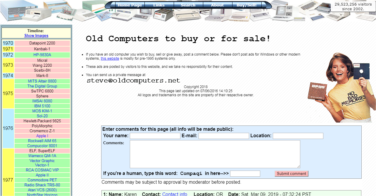
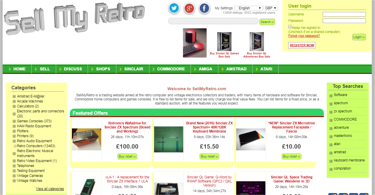
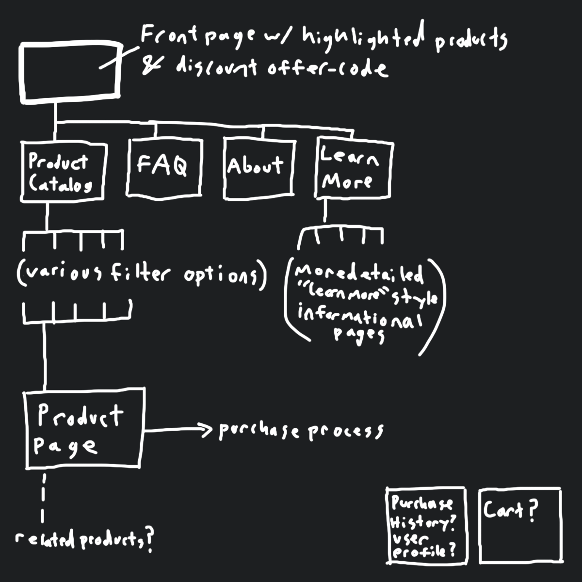
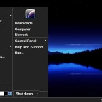
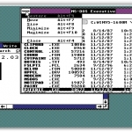
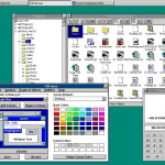
I like that these websites use “web 1.0” visuals, the second one is a bit too garish for me, but nonetheless, these kind of layouts have the added advantage of fast load times and low resource usage. Responsiveness can suffer, but it’s still possible to design such a theme that will function well on mobile devices. Personally, I’d prefer and use a visual theme resembling the user interfaces from that time, as opposed to the webpages.
cat [insert product that can be photoshopped onto GAN cat images sourced form thiscatdoesnotexist.com]
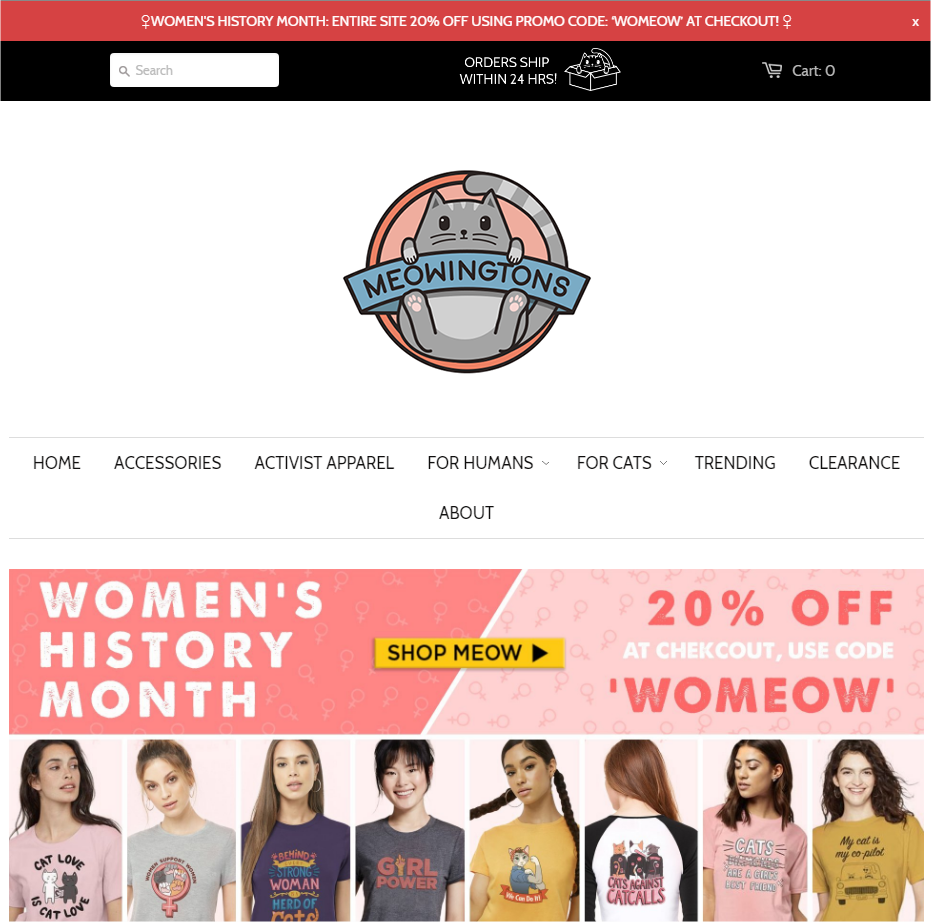
Large prominent branding and promotional/discount offer.
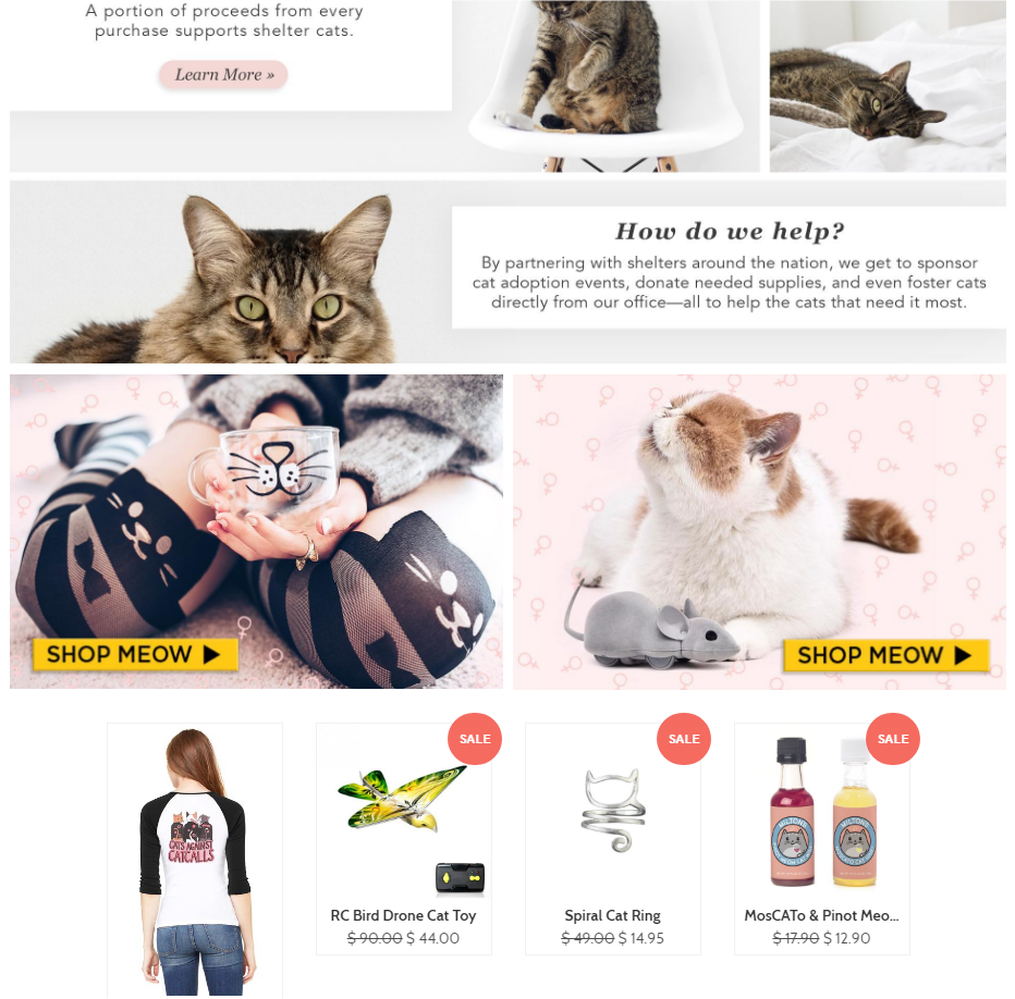
Front page displays product previews and examples in a visually interesting asymmetrical layout. Unlike other examples of this kind of layout, this example doesn’t get too confusing; your eyes naturally go from one thing to another, so even though it’s asymmetrical, there’s still a consistency and linearity.
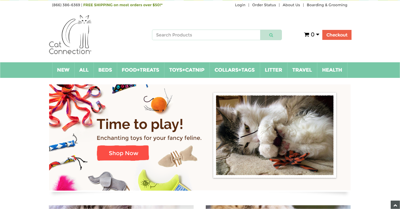
A more standard layout, front page has less immediate focus on branding and driving sales, but still contains product previews/examples.
Overall these two sites have a much more modern design, for obvious reasons, than the vintage computer sites. I’d argue ‘cat related products’ is far less of a niche than vintage computers, wherein, the target audience is more likely to appreciate the choice of ‘retro’ visuals. I think the comparison between these sites gives a good example of old/modern web design motifs: material/flat design can look very sleek and striking, but often involves lots of wasted space; whereas older styling can lead to too much clutter.
B) Answer:
1. what makes a good ecommerce web site?
Focus on the products and use a layout/design that doesn’t distract from the products, instead it should drive focus, again, onto the products. Product availability should be clear, finding products should be easy, purchasing should be straightforward and fast.
2. what makes a bad ecommerce web site?
Visual clutter, but also wasted space, lack of focus on the products, unclear product availability, confusing product catalogs, lengthy purchase process. Slow and unresponsive pages, broken links, and unclear final calculated costs.
3a. For your ecommerce website, what is/are the:
– goals of the site
Provide a visually appealing site that enhances focus on products.
– level of consistency you require; i.e., color schemes, fonts, page layouts, etc.
High consistency, it is important every aspect of the visual theme is consistent so that there are no distracting elements. The vintage computer site should be reminiscent of classic computer interfaces, it should feel ‘comfortable’ and ‘welcoming’ to that target audience; the ‘cat thing’ site should be ‘soft’ and ‘cute’, however, the idea is that I’m using GAN generated cat images, and some (most) of those can look rather…strange. So, I could either drop the whole GAN-concept or only pick the least-horrific images to use on the product views.
– target audience(s) for the site
Fictional Vintage Computers: computer/technology enthusiasts who have an interest in the history of those things, and are perhaps collectors.
Cat Product: pet owners who want their cat to wear top hats and things of that nature. Actually, I never really settled on ‘cat accessories’ so it could be any kind of cat-related product; for instance, the meowingtons site sells cat-themed apparel, so I could do something like that as well. In which case, the broad target audience is people who like cats and cat related accessories. (I drift away from this choice the more I write about it, but I still think it’s a good overall choice for testing out the functionality.)
– site navigation methods
Top navigation bar near branding, should also interconnect related products to some extent. Perhaps a breadcrumb trail if there are many product options. Some kind of trail-like-element would be good for the purchase process regardless.
– graphics (logos, buttons and photo requirements)
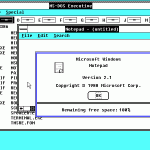
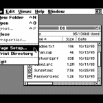
Branding logo, favicon, product images. The computer site should have visual theme reminiscent of classic computer user interfaces (as previously noted). Examples:
– other consideration?
No particular other considerations, but I have thought of that it’s important to make sure the purchase process cannot actually be completed since I’m not really selling any of these things.
3b. Create a ‘site map’ of all the pages on your site. Decide which page will come up first, what it will link to and the interactivity of all pages at your site. This could be hand drawn storyboard, then taking a picture and submitting or drawn using a software.
A general map since I have two separate ideas at the moment, but they could both share a broadly-similar site structure:
